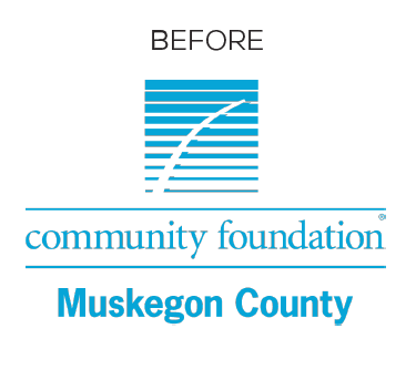
Our previous logo was developed in the 1980s as part of a statewide effort to create a common look and familiarity across all Community Foundations in Michigan. Decades later, many foundations have an established relationship within their own communities, and there is less benefit to maintaining shared branding throughout the state.
While the image of beach grass in the wind has become synonymous with the work we accomplish across Muskegon County, moving in a new direction allows us to create a modern brand that reflects our community, our organization, and our region. We ultimately chose this new logo because of how well it reflects the vibrant and inspiring community we serve.
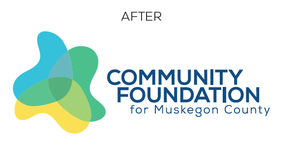
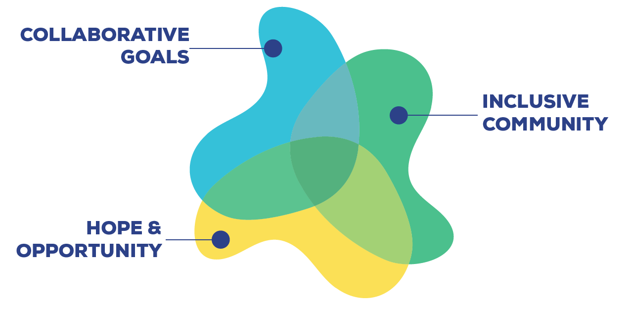 The three intersecting shapes represent:
- Who we support: donors, nonprofits, and the community
- Where we live: lakeshore, green space, and agriculture
- Why we’re here: advancing educational attainment; fostering a dynamic, local economy; enhancing community trust and promoting prosperity for all
- What we value: hope and opportunity, particularly for youth; collaborative community goals and decision making; an inclusive community
But most importantly, our logo represents how these many pieces come together for common good, visually demonstrating the collaboration between our work and the greater community. Where these efforts and goals intersect, the Community Foundation’s impact – and your generosity – multiplies.